SamanthaR9
👋 Hi, I’m Samantha
I’m learning data analytics and building projects in Python, SQL, and visualisation tools to develop practical, job-ready skills. My background is in Literature and Cinema, combining storytelling with data to turn insights into meaningful narratives. The following projects were completed during a Data Analysis short course which lasted around 7 weeks.
👉 Skills Summary
- Python (pandas, data cleaning, EDA)
- SQL (joins, aggregation, subqueries)
- Excel (pivot tables, charts)
- Tableau (dashboards, storytelling)
- Power BI (DAX, reporting)
📁 Projects
📊 Excel and data basics
Sales Performance Analysis Using Excel Pivot Tables and Visualisation
This dataset contains sales performance data including country, customer, demographics, and sales KPIs. It allows for the analysis of profitability and customer behaviour across different markets. It includes structured data (tables) which make it suitable for Excel analysis.
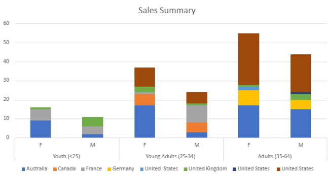
Key Findings: My analysis of the dataset focused on the pivot tables and stacked bar charts, which shows that the most profitable market is Australia, with a total of 63 sales, and that there are consistent sales within each age group and gender. Across all countries and age groups, female customers purchase more than male customers. The youth age category (under 25) have the least amount of sales.
🐍 Python / Google Colab
Analyse Student Performance Dataset in Python
This dataset contains student academic scores across classes, used to calculate performance. The dataset required cleaning, transforming, and grouping before insights could be extracted, making it a suitable choice for Python practice.
Full notebook (including code, cleaning steps, and visualisations): link
This project demonstrates my use of Python in a Jupyter Notebook (Google Colab) to perform exploratory data analysis on a student performance dataset. The workflow included data cleaning, handling missing or inconsistent values, and transforming the dataset to support analysis.
I explored the structure of the data, then engineered a ‘Grades’ column to categorise student performance. Using grouping and filtering techniques, I analysed performance patterns across different classes and visualised the results using bar charts, histograms, and pie charts.
Key Findings:
- Grade A was the most frequently occurring grade overall, suggesting a generally strong level of performance across the dataset.
- Most classes had average scores between 70–80, indicating consistent mid-to-high achievement.
- Class Nine was a clear outlier, with an average score around 40, significantly lower than the other classes.
This performance gap highlights a potential imbalance in student outcomes. If applied in a real educational context, this would suggest the need for targeted intervention for underperforming groups, such as revised teaching strategies or additional academic support. It also demonstrates how visual analysis can quickly identify outliers that may not be obvious from raw data alone.
🗃️ SQL / MySQL Workbench
Relational Database Analysis of Global Population Data
The World database contains relational data on countries, cities, and languages, linked through primary and foreign keys. It is suitable for SQL analysis as it enables exploration of population distribution using joins, aggregations, and grouping.
In this project, I used SQL queries in MySQL Workbench to combine tables and calculate aggregated values such as averages, alongside filtering and grouping to identify patterns in global population data.
Example Query:
Identify countries with the highest average city population to compare urban density across regions and population distribution patterns across cities and countries.
SELECT
  country.Name AS country_name,
  AVG(city.Population) AS average_city_population
FROM city
JOIN country
  ON city.CountryCode = country.Code
GROUP BY country.Name
ORDER BY average_city_population DESC;
Key Insights:
- Singapore and Hong Kong have the highest averages due to highly concentrated urban populations.
- Larger countries tend to have lower averages due to more dispersed city populations.
- This shows that averages can be influenced by distribution rather than overall country size or wealth.
- High urban concentration may reflect economic centralisation, where population is clustered in major cities.
Database Schema ERD Diagram
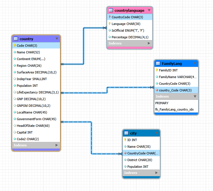
The ERD shows how the country, city, and countrylanguage tables are connected through primary and foreign keys, supporting accurate JOIN-based analysis.
📊 Tableau
Global Health and Life Expectancy Analysis in Tableau
The GapMinder dataset contains global health and development statistics, including life expectancy, population, and economic indicators across countries and time. This made it well suited for Tableau, as the dataset includes both time-series and geographic data, allowing for clear visualisation of trends, comparisons, and global disparities.
The aim of this dashboard was to analyse key patterns that would be useful for organisations, such as understanding how life expectancy has changed over time, identifying regional differences, and exploring relationships between health indicators.

The dashboard presents several visualisations, each highlighting a different insight:
- Life Expectancy by Continent
This chart compares average life expectancy across continents, showing clear global disparities. Europe and the Americas have the highest life expectancy, while Africa remains significantly lower, reflecting differences in healthcare access and overall development. - Life Expectancy Trend
This line graph shows a steady increase in life expectancy across all selected countries over time. This suggests overall global improvements in healthcare, living conditions, and medical advancements, although some countries consistently perform better than others. - Population Growth by Continent Over Time
This visual highlights how population growth varies between continents. Asia shows the highest overall growth, while other regions fluctuate more moderately. These trends are useful for long-term planning, particularly for resource allocation and infrastructure. - Life Expectancy vs BMI
The scatter plot explores the relationship between BMI and life expectancy. There is a general upward trend, suggesting that higher BMI levels are associated with higher life expectancy up to a point, although the spread of data indicates that other factors also influence outcomes. - Population by Gender
This chart allows comparison of male and female populations within a selected country. The distribution appears relatively balanced, which is typical in many developed nations, and the interactive filter enables comparisons across different countries.
Population Growth by Continent Over Time (Worksheet)
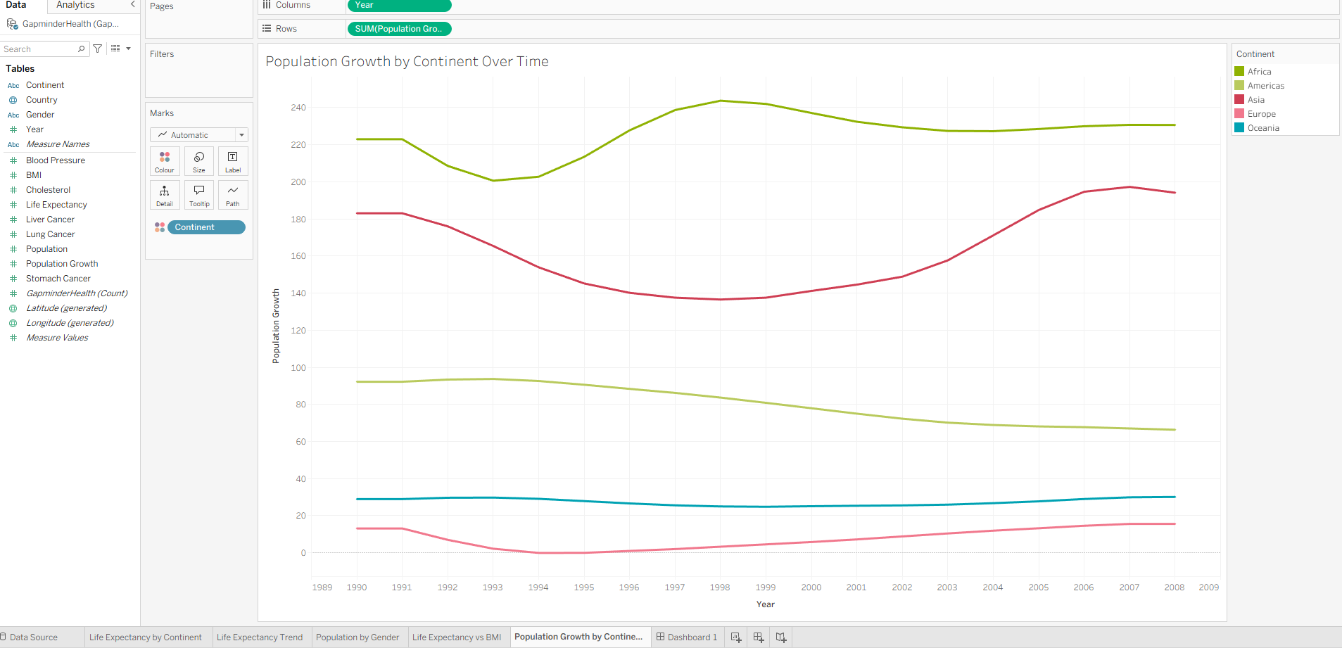 In addition to the dashboard, I also developed individual worksheets to explore specific trends in more detail.
This worksheet provides a focused view of population changes, making it easier to identify patterns and fluctuations. It highlights how growth trends differ significantly between regions, which could influence future policy and planning decisions.
📈 Power BI
Full Power BI Workflow using AdventureWorks and Skillable
The AdventureWorks dataset is a simulated business database containing sales, product, and customer information used for business reporting and analysis. It reflects real world business operations and requires data modelling, transformation, and dashboard creation.
This project demonstrates a full Power BI workflow completed through Skillable labs. The aim was to develop practical skills in data preparation, modelling, visualisation, and dashboard design using Power BI Desktop.
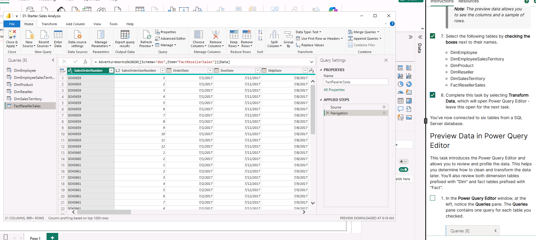
In this lab I imported data from an SQL database (AdventureWorks) and added the raw data into Power Query. I reviewed the initial structure and fields before moving to the next step.
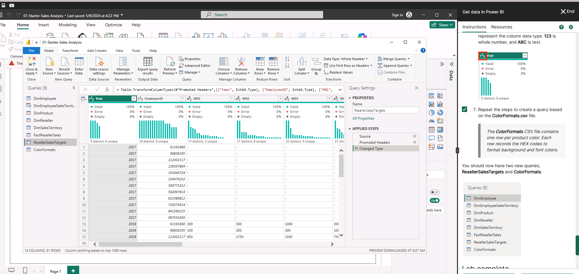
This lab focused on cleaning and preparing the dataset using PowerQuery, ready for reporting and analysis. Data types were corrected, column headers were standardised, and data quality was validated using built-in profiling tools to ensure accuracy before analysis.
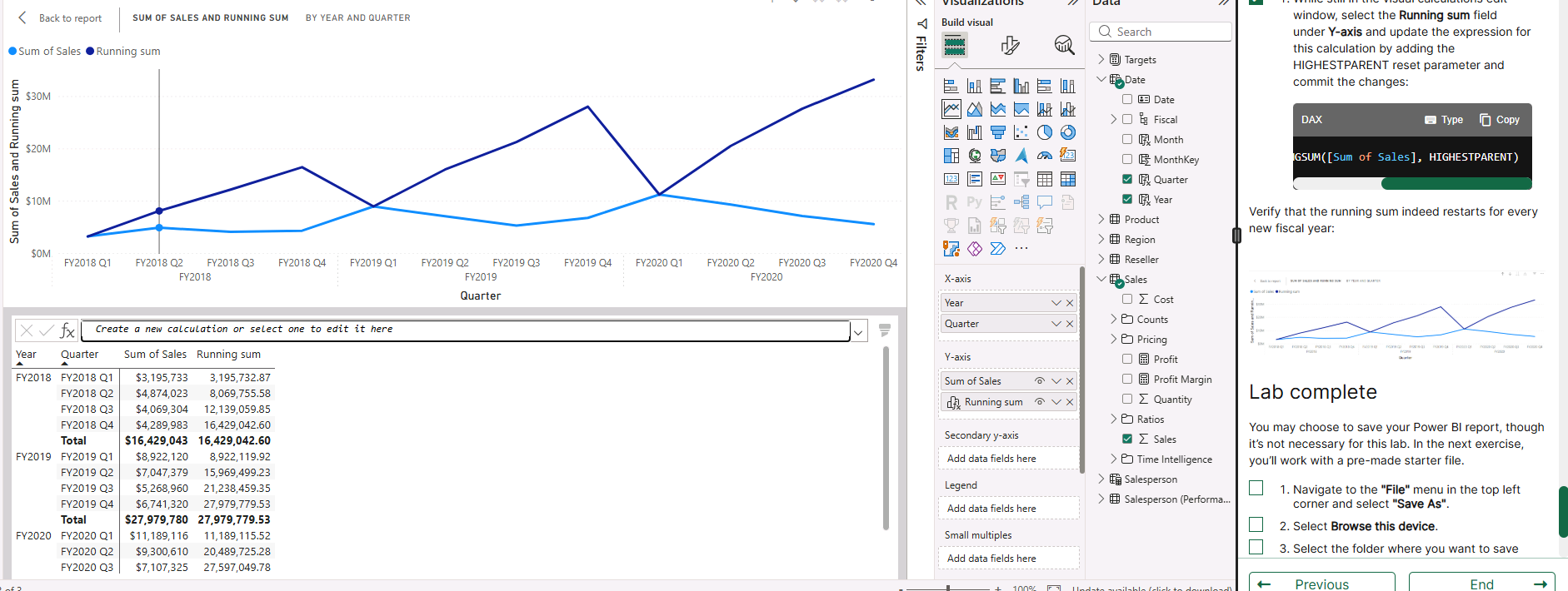
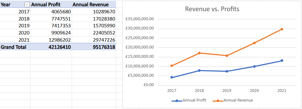
In this lab I focused on creating visual reports, resulting in an interactive dashboard that presents data clearly. For this task I focused on finding the running total (DAX), showed multiple measures on one chart, and conducted time-based analysis.
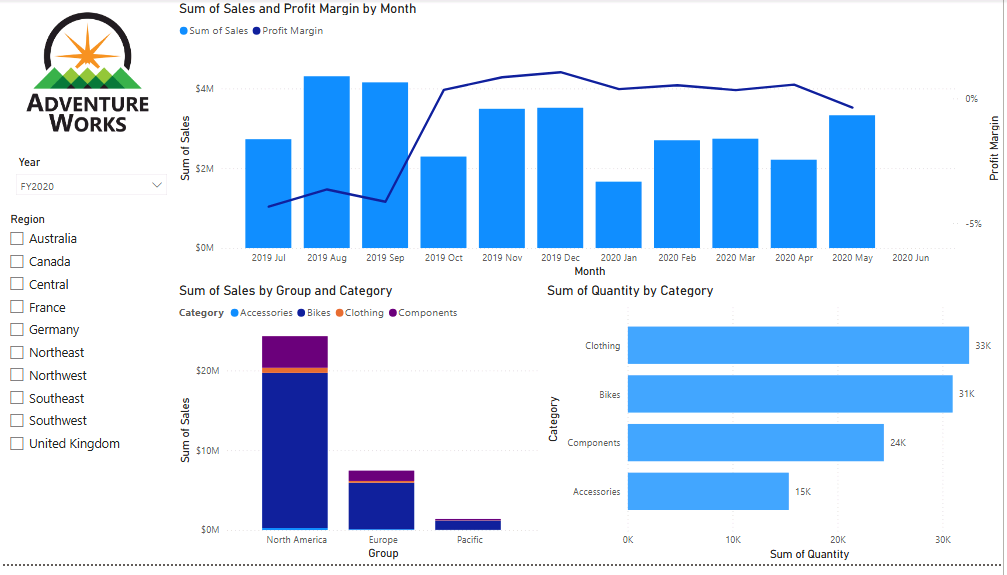
This lab involved assembling visuals into a final cohesive dashboard, providing a high level report and summary of insights. Used a combination of visuals such as combo charts, stacked bar charts, and horizontal bar charts alongside slicers to give a well-rounded analysis.
🤝 Contact
- 📧 Email: samanthaross1@hotmail.co.uk
- 🔗 LinkedIn: Samantha Ross